How to download stock prices in R
Getting stock prices from Yahoo Finance
One of the most important tasks in financial markets is to analyze historical returns on various investments. To perform this analysis we need historical data for the assets. There are many data providers, some are free most are paid. In this chapter we will use the data from Yahoo’s finance website. Since Yahoo was bought by Verizon, there have been several changes with their API. They may decide to stop providing stock prices in the future. So the method discussed on this article may not work in the future.
R packages to download stock price data
There are several ways to get financial data into R. The most popular method is the quantmod package. You can install it by typing the command install.packages("quantmod") in your R console. The prices downloaded in by using quantmod are xts zoo objects. For our calculations we will use tidyquant package which downloads prices in a tidy format as a tibble. You can download the tidyquant package by typing install.packages("tidyquant") in you R console. tidyquant includes quantmod so you can install just tidyquant and get the quantmod packages as well.
Lets load the library first.
library(tidyquant)First we will download Apple price using quantmod from January 2017 to February 2018. By default quantmod download and stores the symbols with their own names. You can change this by passing the argument auto.assign = FALSE.
options("getSymbols.warning4.0"=FALSE)
options("getSymbols.yahoo.warning"=FALSE)
# Downloading Apple price using quantmod

getSymbols("AAPL", from = '2017-01-01',
           to = "2018-03-01",warnings = FALSE,
           auto.assign = TRUE)
## [1] "AAPL"Lets look at the first few rows.
head(AAPL)## AAPL.Open AAPL.High AAPL.Low AAPL.Close AAPL.Volume
## 2017-01-03 115.80 116.33 114.76 116.15 28781900
## 2017-01-04 115.85 116.51 115.75 116.02 21118100
## 2017-01-05 115.92 116.86 115.81 116.61 22193600
## 2017-01-06 116.78 118.16 116.47 117.91 31751900
## 2017-01-09 117.95 119.43 117.94 118.99 33561900
## 2017-01-10 118.77 119.38 118.30 119.11 24462100
## AAPL.Adjusted
## 2017-01-03 111.7098
## 2017-01-04 111.5848
## 2017-01-05 112.1522
## 2017-01-06 113.4025
## 2017-01-09 114.4412
## 2017-01-10 114.5567Lets look at the class of this object.
class(AAPL)## [1] "xts" "zoo"As we mentioned before this is an xts zoo object. We can also chart the Apple stock price. We just pass the command chart_Series
chart_Series(AAPL)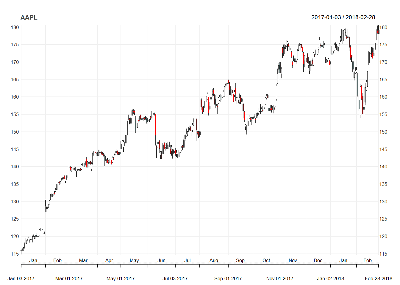
We can even zoom into a certain period of the series. Lets zoom in on the Dec to Feb period.
chart_Series(AAPL['2017-12/2018-03'])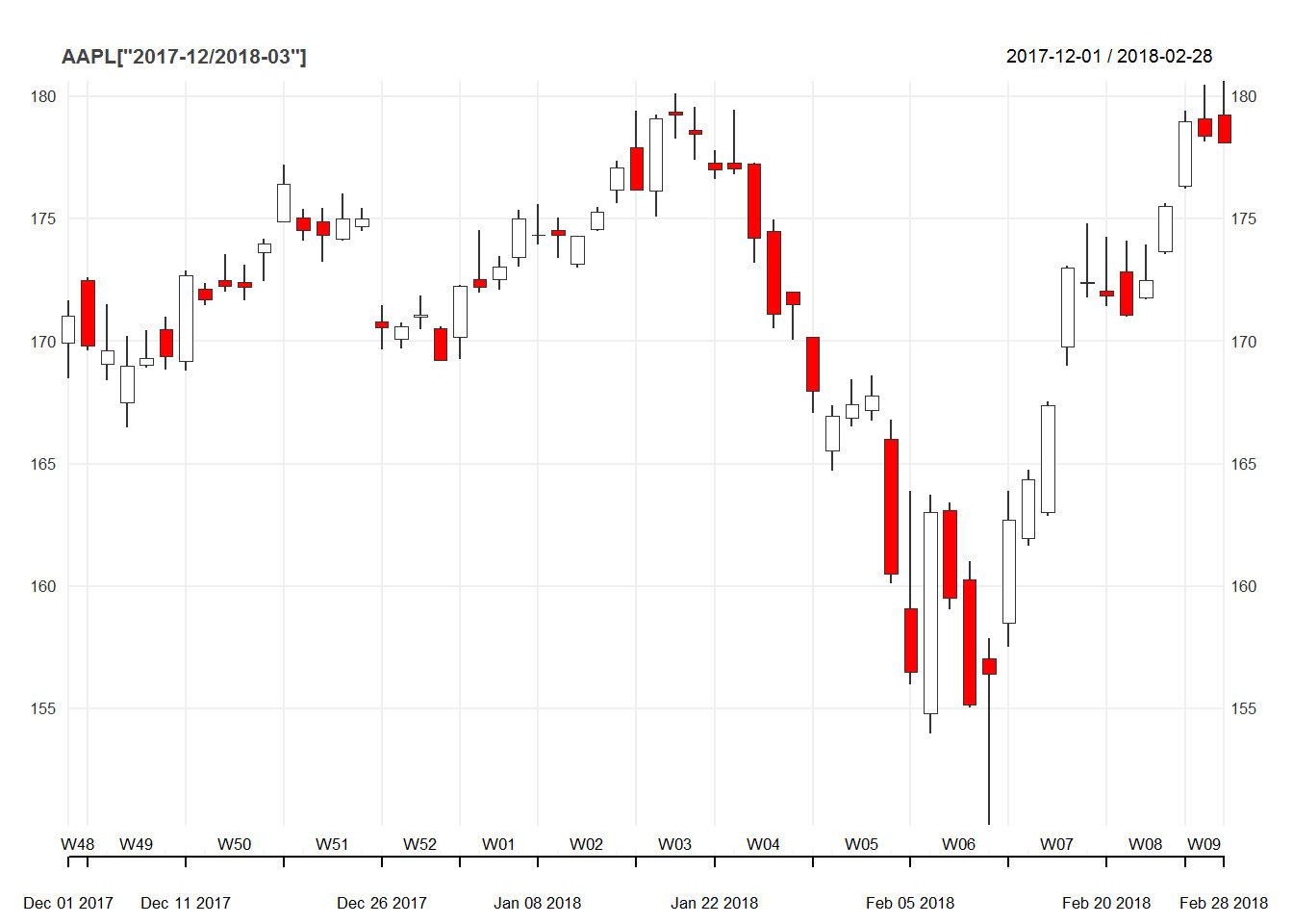
We can download prices for several stocks. There are several steps to this
tickers = c("AAPL", "NFLX", "AMZN", "K", "O")

getSymbols(tickers,
           from = "2017-01-01",
           to = "2017-01-15")
## [1] "AAPL" "NFLX" "AMZN" "K" "O"prices <- map(tickers,function(x) Ad(get(x)))
prices <- reduce(prices,merge)
colnames(prices) <- tickershead(prices)## AAPL NFLX AMZN K O
## 2017-01-03 111.7098 127.49 753.67 67.44665 51.61059
## 2017-01-04 111.5848 129.41 757.18 67.27199 52.38263
## 2017-01-05 112.1522 131.81 780.45 67.20763 53.79208
## 2017-01-06 113.4025 131.07 795.99 67.22601 53.72025
## 2017-01-09 114.4412 130.95 796.92 66.30675 53.32525
## 2017-01-10 114.5567 129.89 795.90 65.87470 52.68785class(prices)## [1] "xts" "zoo"But we prefer the tidyquant package to download stock prices. Below we will demonstrate the simplicity of the process.
aapl <- tq_get('AAPL',
               from = "2017-01-01",
               to = "2018-03-01",
get = "stock.prices")head(aapl)## # A tibble: 6 x 7
## date open high low close volume adjusted
## <date> <dbl> <dbl> <dbl> <dbl> <dbl> <dbl>
## 1 2017-01-03 116. 116. 115. 116. 28781900 112.
## 2 2017-01-04 116. 117. 116. 116. 21118100 112.
## 3 2017-01-05 116. 117. 116. 117. 22193600 112.
## 4 2017-01-06 117. 118. 116. 118. 31751900 113.
## 5 2017-01-09 118. 119. 118. 119. 33561900 114.
## 6 2017-01-10 119. 119. 118. 119. 24462100 115.class(aapl)## [1] "tbl_df" "tbl" "data.frame"We can see that the object aapl is a tibble. Next we can chart the price for Apple. For that we will use the very popular ggplot2 package.
aapl %>%
  ggplot(aes(x = date, y = adjusted)) +
  geom_line() +
  theme_classic() +
  labs(x = 'Date',
       y = "Adjusted Price",
       title = "Apple price chart") +
  scale_y_continuous(breaks = seq(0,300,10))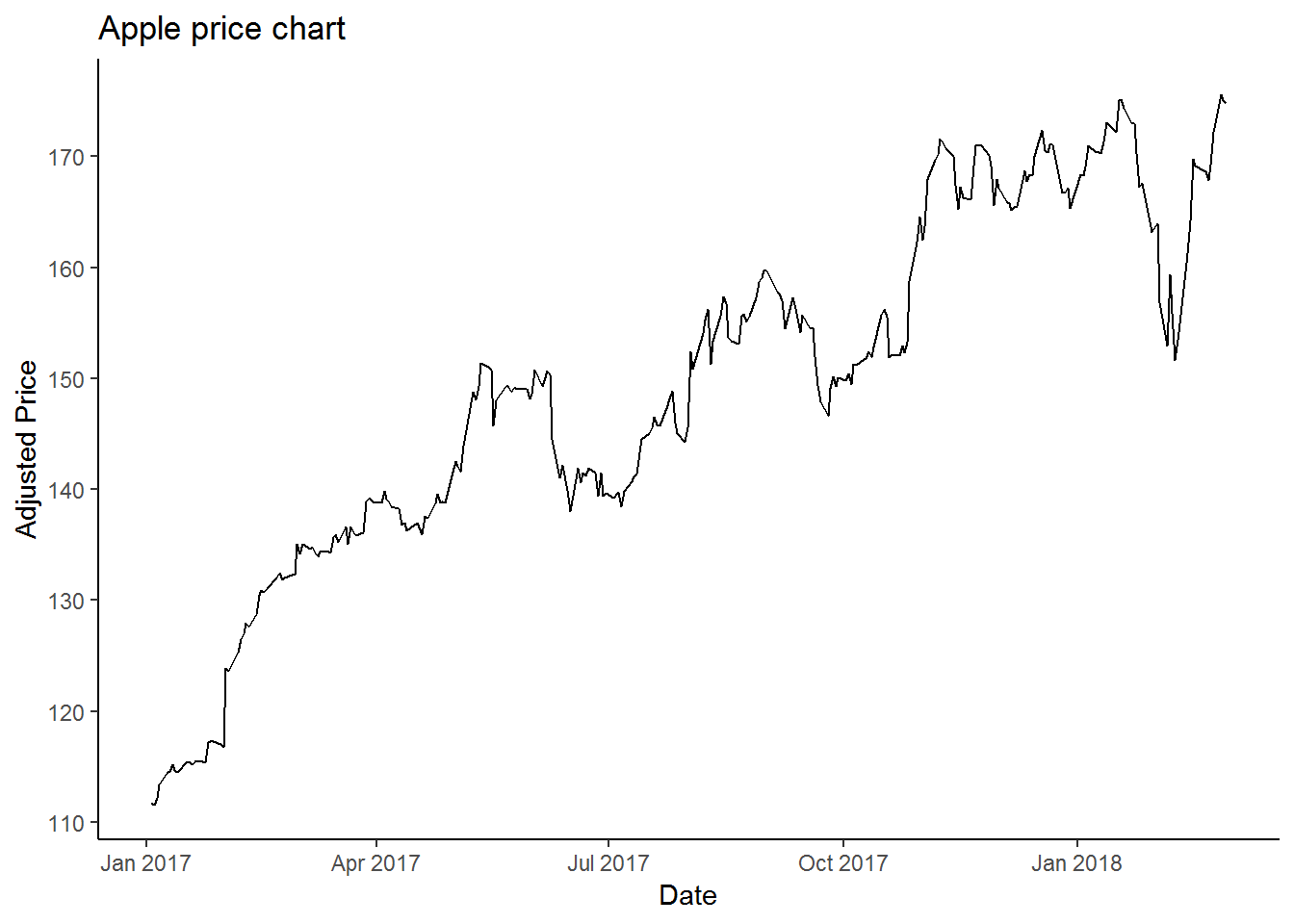
We can also download multiple stock prices.
tickers = c("AAPL", "NFLX", "AMZN", "K", "O")

prices <- tq_get(tickers,
                 from = "2017-01-01",
                 to = "2017-03-01",
get = "stock.prices")head(prices)## # A tibble: 6 x 8
## symbol date open high low close volume adjusted
## <chr> <date> <dbl> <dbl> <dbl> <dbl> <dbl> <dbl>
## 1 AAPL 2017-01-03 116. 116. 115. 116. 28781900 112.
## 2 AAPL 2017-01-04 116. 117. 116. 116. 21118100 112.
## 3 AAPL 2017-01-05 116. 117. 116. 117. 22193600 112.
## 4 AAPL 2017-01-06 117. 118. 116. 118. 31751900 113.
## 5 AAPL 2017-01-09 118. 119. 118. 119. 33561900 114.
## 6 AAPL 2017-01-10 119. 119. 118. 119. 24462100 115.This data is in tidy format, where symbols are stacked on top of one another. To see the first row of each symbol, we need to slice the data.
prices %>%
  group_by(symbol) %>%
  slice(1)
## # A tibble: 5 x 8
## # Groups: symbol [5]
## symbol date open high low close volume adjusted
## <chr> <date> <dbl> <dbl> <dbl> <dbl> <dbl> <dbl>
## 1 AAPL 2017-01-03 116. 116. 115. 116. 28781900 112.
## 2 AMZN 2017-01-03 758. 759. 748. 754. 3521100 754.
## 3 K 2017-01-03 73.7 73.7 72.8 73.4 1699800 67.4
## 4 NFLX 2017-01-03 125. 128. 124. 127. 9437900 127.
## 5 O 2017-01-03 57.7 57.8 56.9 57.5 1973300 51.6We can also chart the time series of all the prices.
prices %>%
  ggplot(aes(x = date, y = adjusted, color = symbol)) +
  geom_line()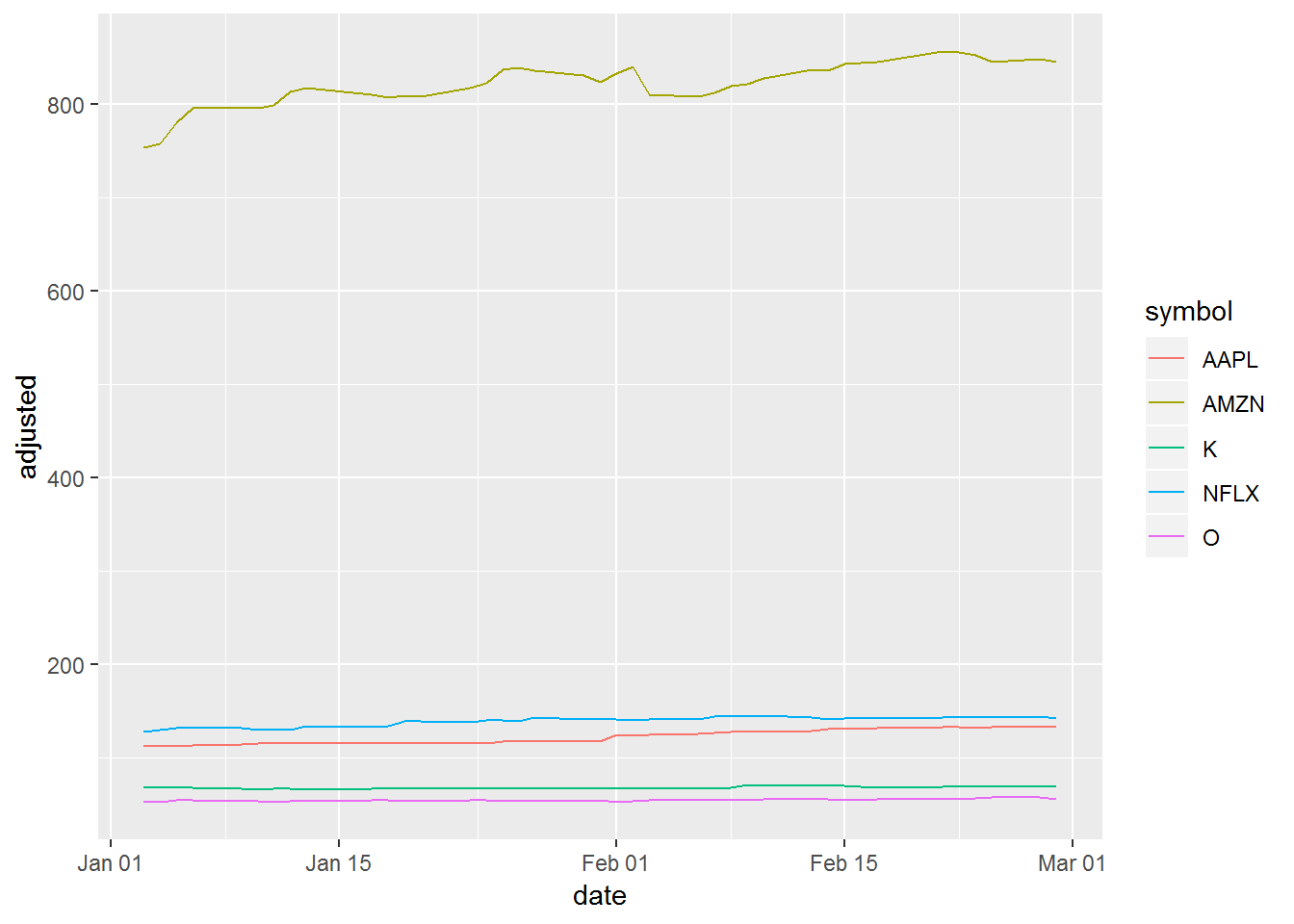
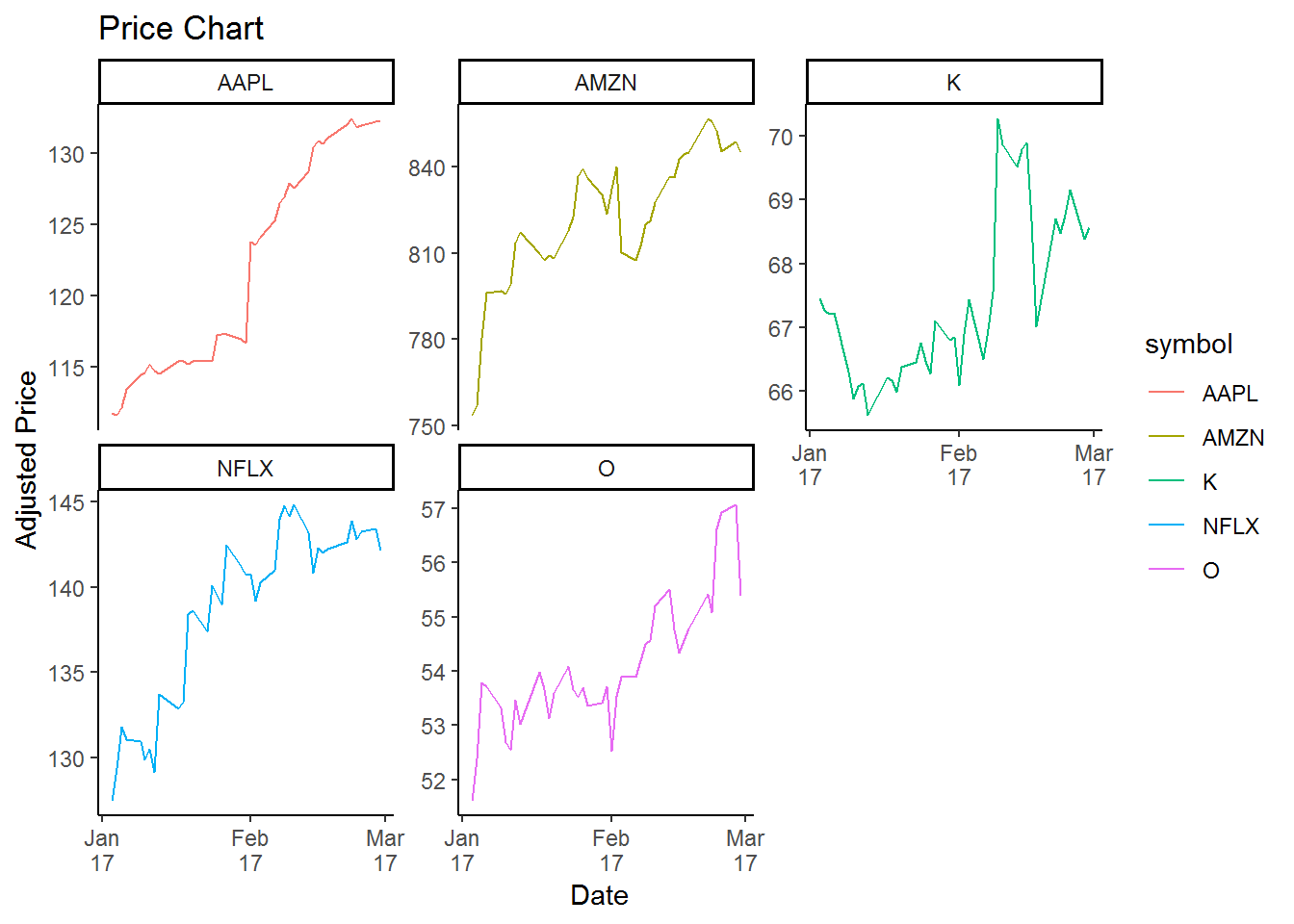
This chart look weird, since the scale is not appropriate. Amazon price is above $800, other stocks are under $200. We can fix this with facet_wrap
prices %>%
  ggplot(aes(x = date, y = adjusted, color = symbol)) +
  geom_line() +
  facet_wrap(~symbol,scales = 'free_y') +
  theme_classic() +
  labs(x = 'Date',
       y = "Adjusted Price",
       title = "Price Chart") +
  scale_x_date(date_breaks = "month",
               date_labels = "%b\n%y")